Jump to content


Photo

R4 poster children


  • Please log in to reply
3 replies to this topic

#1 Mike Patterson

Mike Patterson

    Village Luddite

  • Subscriber
  • PipPipPipPipPipPipPip
  • 2,556 posts
  • Joined: 14-October 07
  • Gender:Male
  • Location:Zanesville, OH

Posted 17 April 2018 - 08:57 PM

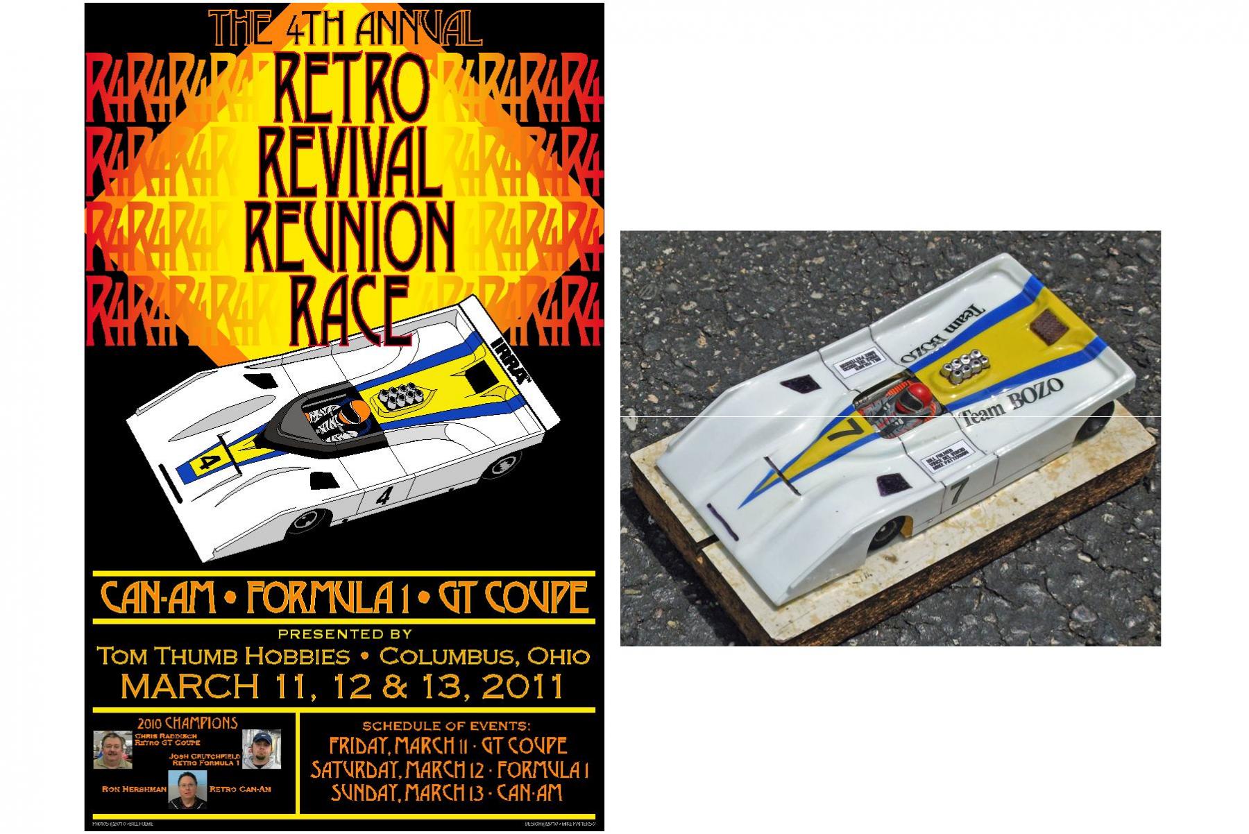
I thought you might be interested in seeing the car photos that I've used to create all my R4 posters. I photograph my own cars, because that way I can vary the camera position and lighting to achieve the desired results. And I hope this doesn't come as too shocking, but all I do is trace the photo. Sometimes I do have to freehand some stuff (driver's suits), but 99.9% of the time it's a straight trace job.


This is the first poster that was used. I designed it and the one for R4/5 together in one massive burst of inspiration. I presented both of them to Mike, and he picked this one.


#4 P&C.jpg


Which meant that the one he didn't pick, became the default design for R4/5:


#5 P&C.jpg


R4/6 was a PITA for a couple of reasons. One, Mike wanted an F1 car, and two, my Mac's hard drive puked. Fortunately I had everything backed up, but my tech had problems finding a new, compatible drive for my old Mac. He finally got it fixed, and I was able to get everything to MIke on time.


#6 P&C.jpg


I went waaay overboard on the engine detail!


So to compensate for the excesses the previous year, I decided the R4/7 poster would only be two colors, black and orange. And I used a much simpler F1 body to copy:


#7 P&C.jpg


And I should add that the reason the poster usually has a black background, is so the design will look the same on a black (the preferred R4 color) T-shirt.


The rest to follow shortly.


  • Cheater, Jencar17, SlowBeas and 4 others like this

I am not a doctor, but I played one as a child with the girl next door.


#2 Steve Deiters

Steve Deiters

    Posting Leader

  • Full Member
  • PipPipPipPipPipPipPip
  • 2,299 posts
  • Joined: 28-May 07
  • Gender:Male
  • Location:Cincinnati, OH

Posted 18 April 2018 - 11:41 AM

Many thanks for the post and the posters.


  • Cheater likes this

#3 Mike Patterson

Mike Patterson

    Village Luddite

  • Subscriber
  • PipPipPipPipPipPipPip
  • 2,556 posts
  • Joined: 14-October 07
  • Gender:Male
  • Location:Zanesville, OH

Posted 18 April 2018 - 07:57 PM

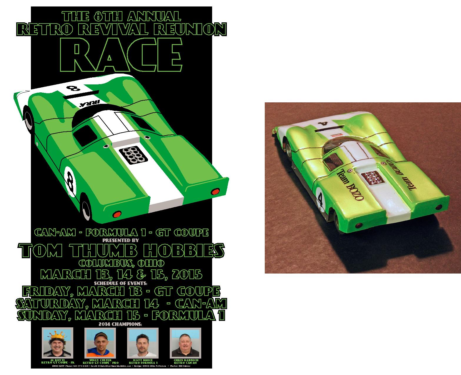
For R4/8, I got away from my usual red and orange color palette, and went green. I've always been inspired by Art Deco and Streamline Moderne design elements, and I was very happy with how it turned out:


#8 P&C.jpg


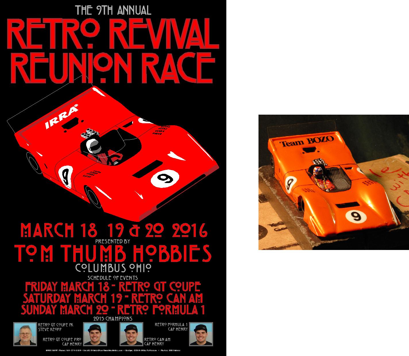
Usually the font I decide to use will point me in a certain design direction. The R4/9 poster has me flattening out the detail in the car even more, again echoing Art Deco influences:


#9 P&C.jpg


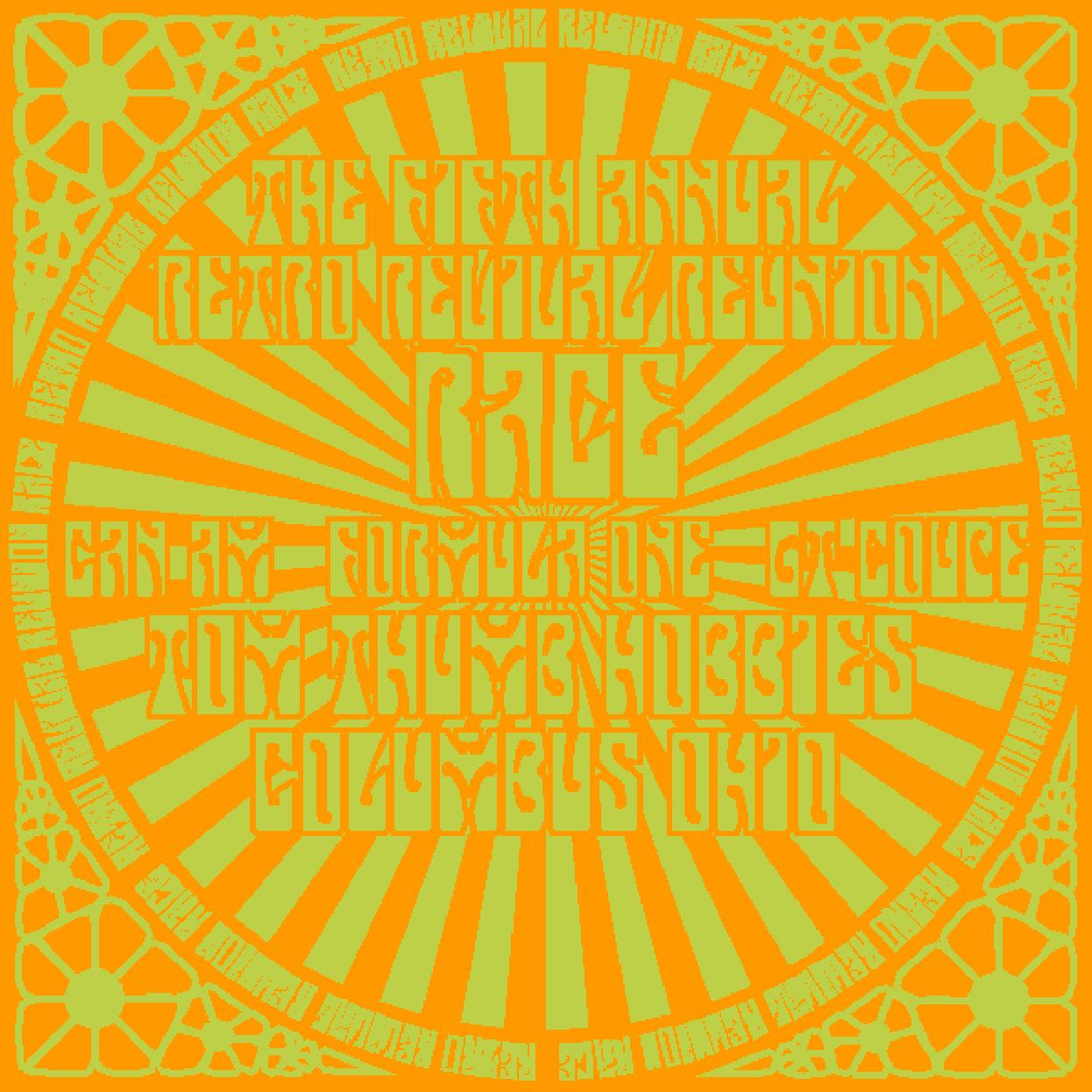
Which brings us to R4/10. The basic round design has existed since the R4/5, but I was having a hard time working a car into the overall design. I finally came up with something that worked reasonably well. And if you stared too long, it made your brain hurt!


#10 P&C.jpg


And for R4/11, I didn't even use a car. I just took a photo of the body sitting on my jig. A return to the flattened/graphic look:


#11 P&C.jpg


That's all so far. Next time I'll post some sketches/roughs of designs that didn't make the cut.


  • Jencar17, Samiam and Eddie Fleming like this

I am not a doctor, but I played one as a child with the girl next door.


#4 Mike Patterson

Mike Patterson

    Village Luddite

  • Subscriber
  • PipPipPipPipPipPipPip
  • 2,556 posts
  • Joined: 14-October 07
  • Gender:Male
  • Location:Zanesville, OH

Posted 19 April 2018 - 08:53 PM

Here are a couple of different takes on the R4/4 poster. This was before I learned that the design must incorporate the previous year's winners. And, the fewer colors, the better:


#1A.jpg


I liked this design for the R4/5. I thought the font I used had a proper "retro" look. Unfortunately, this was when I learned that the design must include some type of race car:


#1B.jpg


Here's another R4/5 design idea. Again, not viable because there's no car. This one would resurface in a different color combination in a few years:


#1C.jpg


The next is a early version of the R4/7 poster:


#7B.jpg


I don't save many development drawings of the cars. Once I start, I tend to keep working on the same drawing until its finished. But I did save this screen shot of the R4/8 Lola under construction:


#8A.png


That's about all the good R4 stuff I have. I didn't post any of the car drawings by themselves because (heaven forbid a fellow slot racer would do such a thing!) I didn't want them easily available for anyone to copy.


Thanks for looking! :D


  • Jencar17 and Eddie Fleming like this

I am not a doctor, but I played one as a child with the girl next door.


Electric Dreams Online Shop