As I get more experience in determining how a paint scheme's gonna look at the end of things (barring disasters, like the Ti-22 I showed last week), I start tossing myself challenges like masking off an inside to go around something I'll paint outside later. Yah, I'm even snotty with myself. Go figure.
Here's an opportunity to talk a little about how I "second-guess" myself in laying out a mask job.
I wanted to do a Ti that showed its Norris Industries pedigree; I chose the white and light blue scheme, and for a trim I went with a bolder look. While I usually taper or curve the long lines of a mask to show off, this scheme wanted parallel lines. I did vary the different stripes' widths, though. See "snotty" above.

Now, there are two places in this pic where you see my laying-out stuff in action:
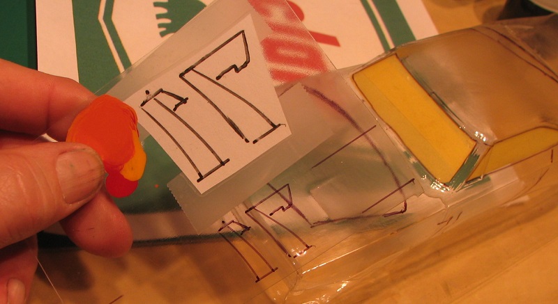
First, I sketched the general mask design on the outside of the car with a Sharpie like always, and put the tape down on the inside with that as my rough guide.
Second, I laid out the wheel cutouts &c. and sketched in what I wanted for the side panels. Then, I put two strips of tape down on my cutting mat and laid out that pattern on those, mirror-image, accurately, and cut those out. Then it's just a matter of getting those bits inside the body in the right location. Lucky thing, this Tamiya tape will pick up and re-apply many times on a clean surface and still tack down good enough to mask well.

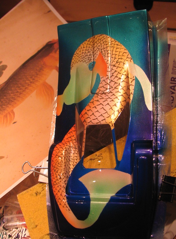
So here you see what I got in mind - "DUFFY Industries" set into the nose art. Breaking up the long lines sorta made sense to me thematical-like, since I had made that jumble up front and in back, just looked better if I broke it up on the sides too.
The hardest part of this stuff is knowing how much area to mask off for your second color. I bet if I'd picked a real bold contrast instead of the two light shades here, it would be more cluttered. In these colors, it just looks homogeneous.

The white's like I always like to do, very fine fog of Pearl Gold (my best job of that yet, I think) then light overall Pearl White all backed with solid white. The blue is a few drops of Faslucent Turquoise in Pearl White.
Now to fit the lettering in.

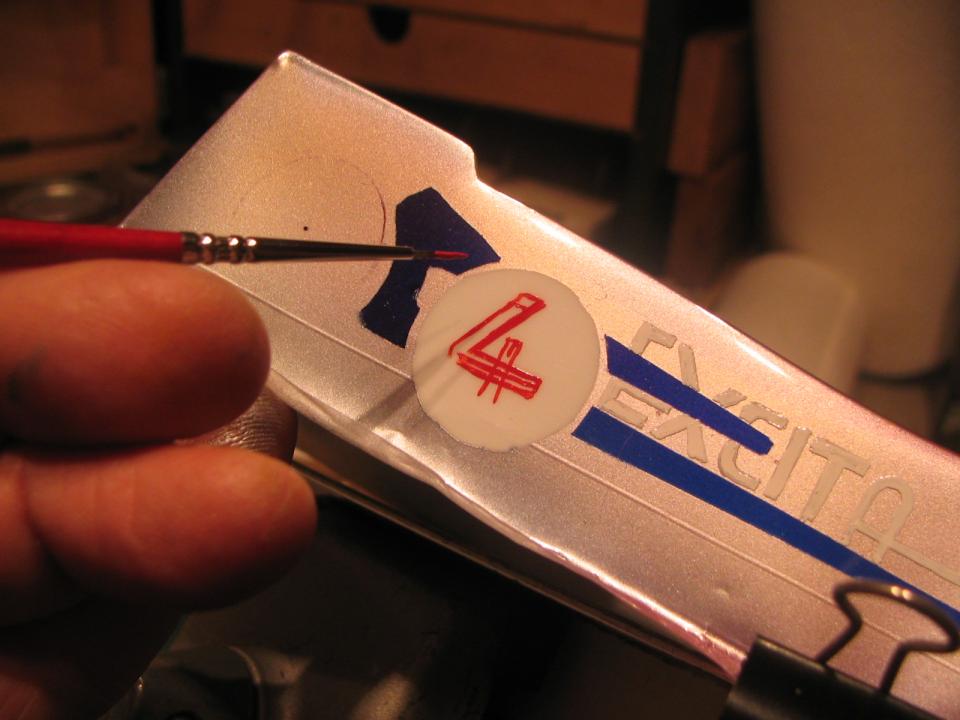
I saw that the drastic dips & lumps across the field were gonna affect how we read the letters, so I plotted out how to write 'em in a way that doesn't stretch one around a corner too much. Like, the first f of the Duffy runs just alongside that edge of the radiator hump, and I fattened up the u where it climbs up out of the trough so it looks better when viewed head-on.
This part was free-handed. The INDUSTRIES now, that I knew was beyond me. I needed planning.
First thing, I laid out my available space, including the developed length of whee the line would dip down over on the right of the hump. Then, I practiced.

Here you see the developed length of the lettering field drawn onto my cutting mat like two goalposts (with a note to myself above!) - then some practice tapes stacked up, inside of which I wrote down INDUSTRIES until I got something that would fit.
Once I got that, I went & taped that right down under the work area and copied what I'd done, with the tape as my guide to spacing & proportions & all.

- And I still kinda got it crowded over there at the end! Mostly, though, I just feel pretty lucky that it all fit in some proper manner. Other thing, even tho' the intent was to make this scheme blockier and bolder than the little pinstripes on the Norris car, the size of the sponsor's name here is really pretty overpowering. Oh well.
"It's a bloody slot car, shuddup."
Duf


