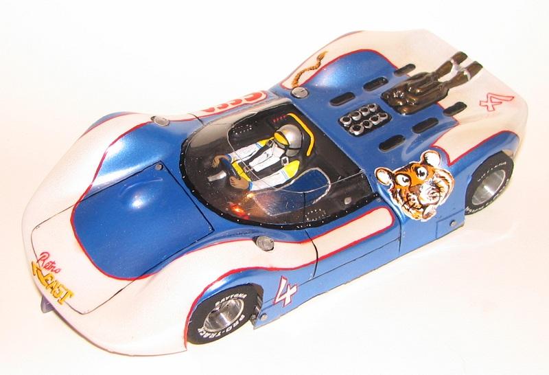
Let's talk layout. This was an interesting exercise in stuffing things onto a limited canvas, and I got a couple little victories on it & also a couple things I wish were different.
The "Esso" sponsor theme was suggested by TonyP. I'd never done anything like the tiger before, but I've watched sign painters and had a basic idea of the basic idea.
The real challenge was in finding a place for him to go. Far from the flat canvas afforded by the current fashion in Retro, the knobbby Lotus 40 (always reminds me of an apple fritter) forces everything to drape over all these lumps & bumps! Works great for skinny stripes and such, I guess, but I couldn't place the "sponsor's" graphics in a way that would go along with such.
So I hit on the sorta-asymmetrical pattern here:

Since I try to leave the front panel for just the lane sticker (pulling 'em off will take some paint along, sooner or later), the only other large out-facing area was the spot just aft of the doors. Okay, so I laid out the white fields to clear that spot, deliberately outlining it to make the thing look deliberate - and on the opposite side, I widened the stripe to include the company logo:

- And that's one of the things I think went wrong: the bright, bright RED of the One-Shot paint should have been darkened a bit, more in line with what the Esso red was.
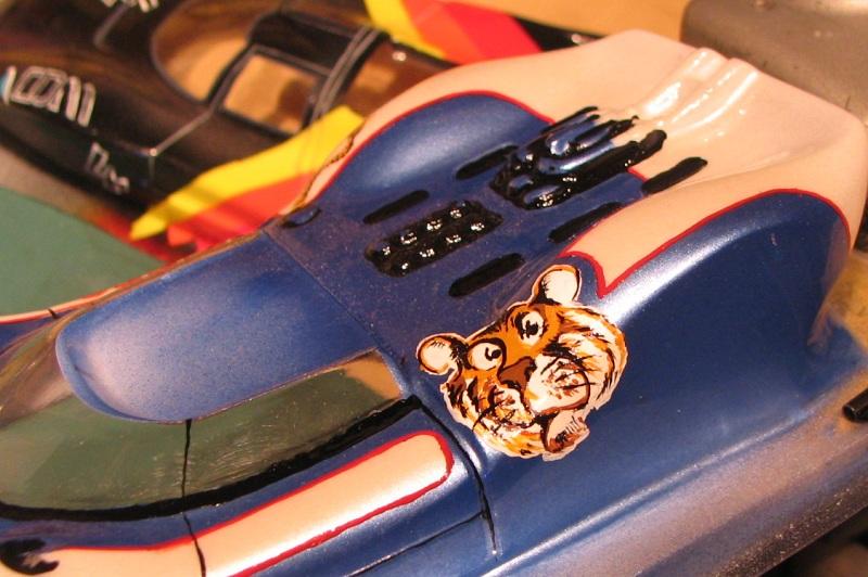
Anyway, before I did any painting or masking, I sketched the tiger several times on the body with a Sharpie. See, the surface there's a real topological anomaly, and I needed to "skin" the tiger in a way that hid the distortion.
What I decided was, I couldn't just work to an angle that the eye would sorta be naturally be forced into: the curvature of the face was gonna be wrong somewhere, no matter what I did. So I stretched it into a skin that wouldn't look quite right from
ANY angle!

What you see here has the tiger's face taffy-pulled from right ear to left jowl. When
I look at it, I sort of adjust my view to "see" it in its least-distorted vantage, and that works. Maybe I'm kidding myself.
The real fun with this stuff is, I had to lay down the white field for the whole face
FIRST, so I had to second-guess how it would drape right at the start. I had sketched out the distorted face in Sharpie, but I couldn't leave that down when I painted over (I'd already learned that hard lesson on the o'Dubhthaigh job!), so I ended up taking a hard look, washing the Sharpie sketch off, and painting quick from memory!
Then, light tan, brown, dark brown, black. Like a sign painter.
Lotta fun.
Duf
.


